Flat Cut Letters & Logos: A Wholesale Buyer's Guide
News Details
Flat cut letters and logos give business signs a clean, sharp look. They suit office walls, shop entrances, hotel reception areas, and building names. With the right material and finish, a simple design can make a strong impression.
However, buying flat cut letters signage involves more than choosing a font. Sign companies, design firms, and contractors also need to check thickness, artwork, mounting, and site conditions.
This guide explains what to include in your specification so you can compare quotes, approve samples, and order with greater confidence.
What Is a Flat Cut Letters Sign?
A flat cut letters sign uses individual characters cut from a flat sheet or plate. The material thickness forms the depth of each letter. The same method can create logos, numbers, and simple graphic shapes.
Unlike hollow fabricated letters, flat-cut letters do not use separate faces and side walls to create depth. Instead, each piece has a solid profile.
This makes them a useful choice when the design calls for clear outlines and modest depth. Mounted close to the wall, they create a neat appearance. With spacers, they can produce stronger shadows and a floating effect.
Flat-cut metal faces are opaque. Therefore, if nighttime visibility matters, plan external lighting or discuss a separate backlighting assembly.
Choose Metal Letters for the Design and Site
The right material depends on the desired look, letter size, wall, and exposure. Avoid choosing by surface color alone.
| Material | Why buyers consider it | What to confirm |
| Aluminum | Low weight and a wide choice of painted finishes | Alloy, thickness, coating, and edge treatment |
| Stainless steel | A crisp metallic look for modern spaces | Grade, surface finish, and exposure conditions |
| Solid brass | A warm gold tone and substantial feel | Alloy, weight, protective finish, and aging preference |
For example, a large wall logo may benefit from a lighter material. A small hotel reception sign may place greater value on the texture and warmth of brass.
River Stone lists aluminum and stainless steel options for custom non-illuminated metal signage, including solid flat-cut construction. Buyers can use these options as a starting point for a project-specific discussion.
Flat Cut Solid Brass Letters for Premium Spaces
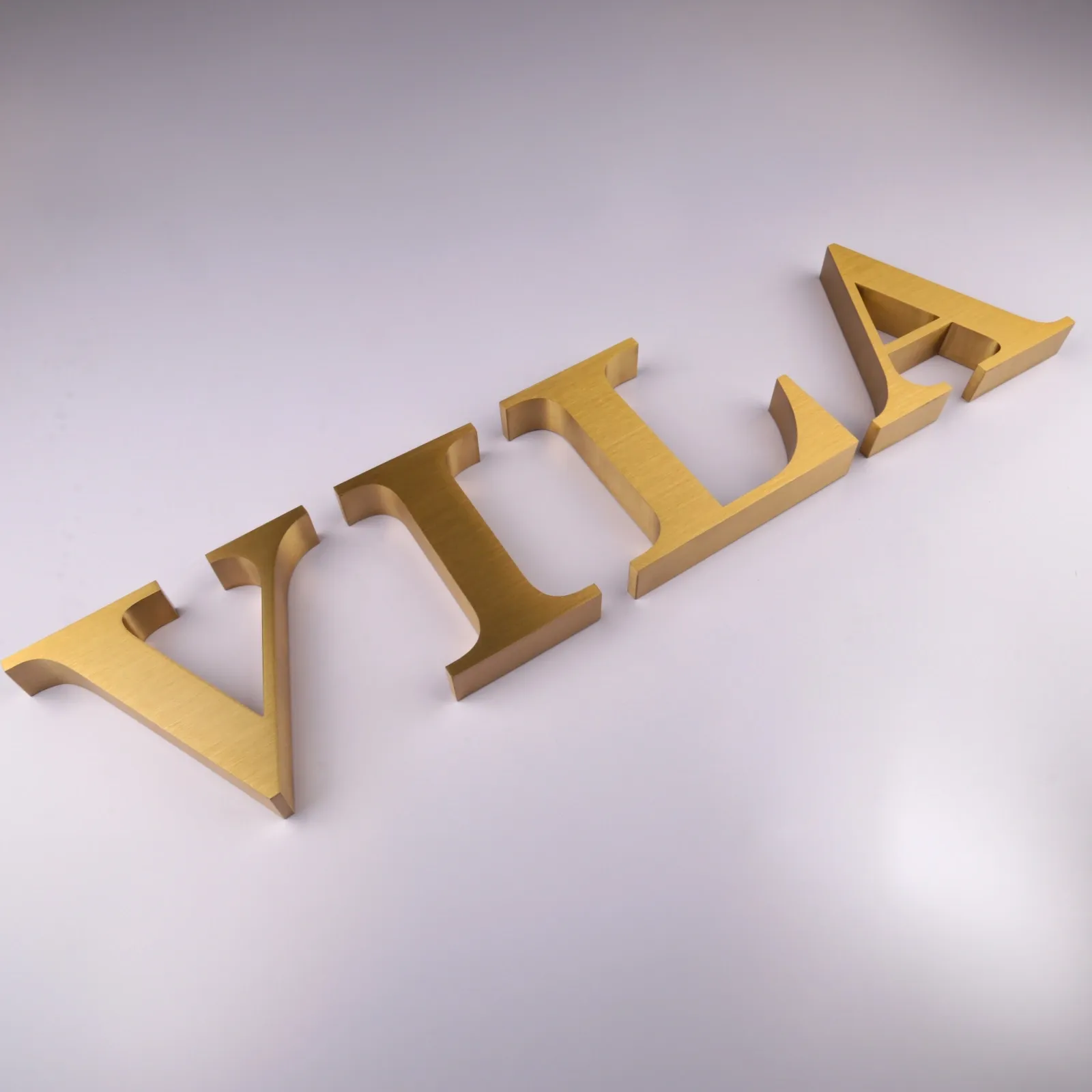
Flat Cut Solid Brass Letters suit projects where the metal itself is part of the visual identity. Their warm tone pairs well with stone, timber, and dark painted walls.
Typical design settings include boutique storefronts, hotel lobbies, professional offices, and restaurant entrances.
When ordering Solid Brass Letters, ask the supplier to state the base material clearly. Solid brass differs from stainless steel or aluminum with a brass-colored coating. Each can serve a design goal, but they should not be treated as the same specification.
Also, agree on how the surface should age. Uncoated brass develops a patina over time. A clear protective finish can slow that change, although it still needs suitable care.
River Stone’s solid brass dimensional letter range includes brushed natural brass with clear lacquer protection and custom options for size, font, thickness, and mounting. Confirm the construction and finish required for your specific flat-cut order.
For an inquiry, share your requirements through the custom flat-cut brass letters product page.
Prepare Artwork for Metal Alphabet Letters and Logos
Accurate artwork helps turn a design into a consistent finished sign. For metal alphabet letters, supply vector files with the text converted to outlines. This preserves the character shapes if the supplier does not have your font.
For logos, identify any small or separate elements. Dots, narrow lines, and enclosed shapes may need special attention during cutting and installation.
Before production, review:
-
Overall size: Confirm the full sign width and height.
-
Letter spacing: Approve the complete layout, not just individual characters.
-
Fine details: Ask the supplier to check thin strokes and small gaps.
-
Separate parts: Show the position of every dot, symbol, and logo element.
-
Orientation: Mark the front face and direction of any brushed finish.
If the original artwork contains details that are too fine for the chosen size, request a revised drawing for approval. Any change to a brand mark should remain subject to the client’s approval.
Match Thickness and Finish to the Viewing Distance
Greater thickness adds visible depth, but it also adds weight and material cost. Choose it alongside letter height and fixing requirements.
For a reception wall, a slim profile may deliver the desired effect. For a larger entrance sign, greater depth or wall clearance may create more visible shadows.
Surface finish also changes how the sign reads. Brushed metal gives a textured appearance, while polished metal reflects more of its surroundings. Painted finishes can help match brand colors.
However, a digital image cannot fully show metallic texture or reflection. For projects where appearance matters closely, approve a physical sample under lighting similar to the final site.
For repeat orders, retain that sample as a reference.
Plan Flat Cut Letters Signage for Outdoor Use
Outdoor flat cut letters signage needs a clear description of the installation environment.
An inquiry that only says “letters signs outdoors” leaves key questions unanswered. Include the site location, wall material, exposure to rain, and whether the property is near the coast.
Ask the supplier to confirm:
-
The proposed metal grade and finish
-
Suitability for the stated exposure
-
Treatment of faces, edges, and fixing points
-
Cleaning and maintenance guidance
-
The expected appearance as the finish ages
Also, consider contrast. Metal letters that look clear against a dark sample board may blend into reflective glass or pale stone.
Finally, check visibility at the actual viewing distance. A full-size paper layout can help the project team judge scale before production begins.
Agree on Mounting and Installation Details
A good mounting plan supports both the sign and its appearance.
Rear studs can hide fixing points. Spacers can create a consistent gap between the letters and the wall. A backing panel may help group complex logos or simplify positioning.
The correct method depends on letter weight, wall construction, and exposure. Therefore, provide wall details early and have the installer confirm the proposed fixings.
Request a full-size installation template and a drawing that shows spacing, fixing locations, and wall clearance. For multi-part logos, ask for clear part labels.
These details help installers reproduce the approved layout and reduce on-site guesswork.
Compare Wholesale Quotes on the Same Basis
The lowest unit price does not always represent the lowest project cost. A useful comparison requires matching specifications.
Send each supplier the same brief:
-
Vector artwork and approved dimensions
-
Material, thickness, and finish
-
Quantity and number of locations
-
Mounting method and wall details
-
Sample requirements
-
Packaging and labeling needs
-
Delivery destination and required arrival date
Then check whether the quote includes hardware, templates, protective packaging, and freight.
For repeat projects, agree on acceptable finish variation and how future batches will match the approved sample. Before dispatch, request photos showing the full set, key details, and packing labels.
Source Custom Flat Cut Letters and Logos from River Stone
A successful flat-cut sign combines clear artwork, suitable metal, consistent finishing, and a practical mounting plan.
Whether your project calls for simple metal letters or a detailed brass logo, start with a complete specification. This gives the manufacturer a sound basis for reviewing the design and preparing a useful quotation.
Explore River Stone’s custom signage range and send your artwork, dimensions, quantity, finish reference, and site photos to discuss your next project.


