ADA-Compliant Braille Signs: A Buyer's Specification Checklist
A practical buyer checklist for ADA signs, raised characters, Braille, materials, placement, and accessible signage projects.
2026/10/10
Reading volume: 0
News Details
In offices, hotels, schools, hospitals, malls, and public buildings, signs need to do more than just indicate room names. They must also help people navigate the space safely and efficiently.
That’s why ADA signs are a critical component of many commercial projects. For procurement teams, the key is to define sign specifics before production begins. A clear checklist helps minimize errors, delays, and costly reworks.
This guide outlines the key points buyers should verify when ordering accessible signage, including raised characters, Braille, contrast, materials, and placement.
What are ADA Braille Signs?
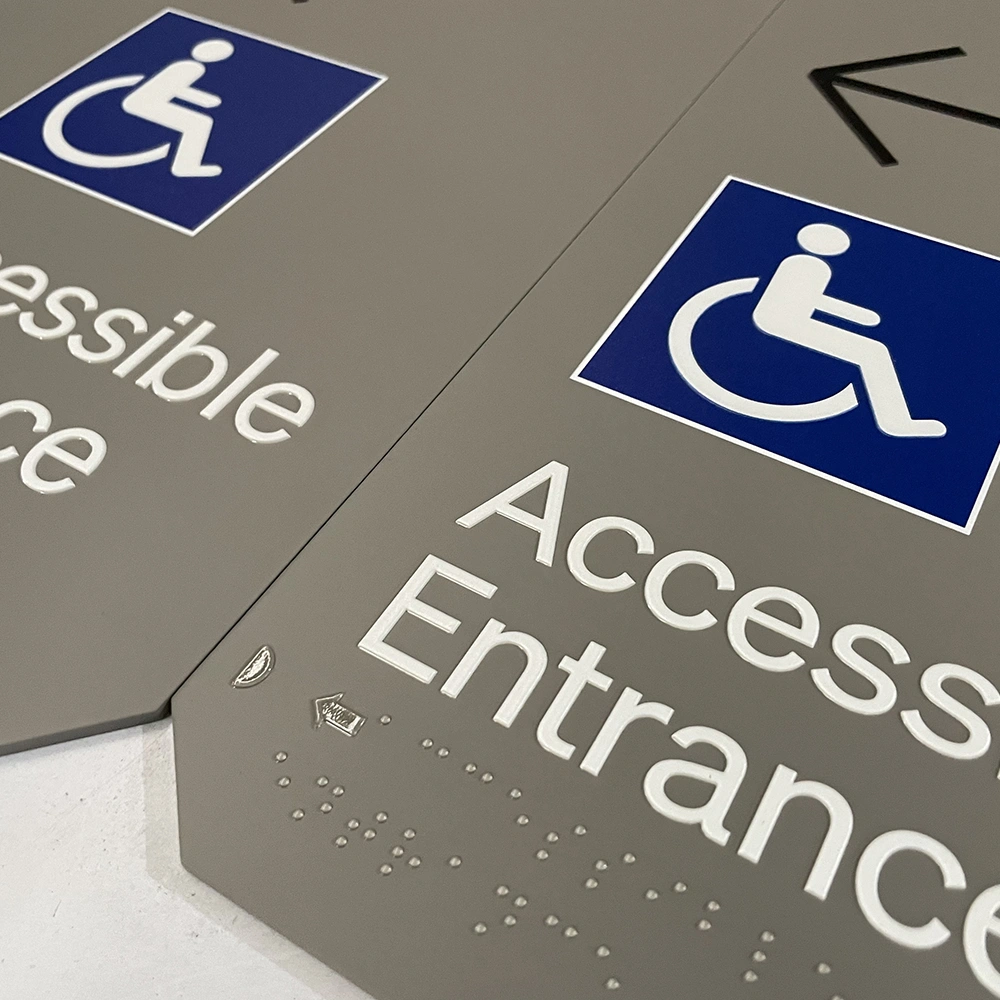
ADA Braille signs are signage designed to support accessibility in public and commercial spaces. They typically feature raised characters, Grade 2 Braille, high contrast, and proper installation.
These signs are commonly used for permanent rooms and areas, such as restrooms, stairwells, exits, room numbers, floor levels, and utility closets.
In many cases, tactile text and Braille work together. Raised text allows users to read by touch, while Braille conveys information through dot patterns. Therefore, buyers should not treat Braille as the only necessary feature.
Tactile Signs vs. Braille Signs
Many buyers search for tactile signs vs. Braille signs because the terms can be confusing.
Tactile signs feature raised characters, numbers, or symbols that can be felt by hand. Braille signs use raised dots that are read through touch.
In many ADA signs, both features are required together. For example, a room sign may display “ROOM 205” in raised letters, with Braille positioned below the text.
So when preparing a specification, don’t just write “Braille sign.” Instead, list the exact requirements: raised text, Braille, pictogram, contrast, size, material, finish, and installation method.
Checklist 1: Confirm Where ADA Signs Are Needed
First, verify which signs must comply with ADA Braille sign requirements. Common locations include permanent rooms and spaces.
These may include restrooms, hotel rooms, office spaces, meeting rooms, stairwells, elevator lobbies, exits, and floor level signs.
However, not every sign follows the same rules. Some directional signs, overhead signs, and temporary signs may have different requirements. Because regulations can vary by location and project type, buyers should confirm final requirements with the architect, contractor, code consultant, or local authority.
Checklist 2: Use Clear Raised Characters
Raised characters are one of the most critical elements of accessible signage. They enable users to read the sign by touch.
The text should be simple, clean, and easy to feel. In most cases, avoid thin scripts, decorative fonts, sharp edges, or elaborate letter styles.
For optimal results, use uppercase letters with a clear sans-serif style. Also, maintain sufficient spacing between characters so the text does not feel cramped.
Raised characters should be smooth and durable. They should not peel, crack, or have rough edges under normal use.
Checklist 3: Add Correct Braille
Braille must be clear, consistent, and positioned correctly. It is typically located below the corresponding raised text.
The dots should have a clean shape and proper spacing. If the dots are too flat, too sharp, or too close together, they may be difficult to read.
Also, ensure the Braille text matches the raised text. A spelling error or incorrect room number can cause significant issues during inspections and use.
Before mass production, it is advisable to carefully review the sign schedule. This is especially important for hotels, offices, and schools with numerous room numbers.
Checklist 4: Check Contrast and Finish
Accessible signage should be easy to read both visually and tactilely. Therefore, contrast is crucial.
The text and background should be clearly distinguishable. For example, dark text on a light background or light text on a dark background is easier to read.
Also, avoid strong glare. A high-gloss finish may look premium, but it can reflect light and make the sign harder to see. In many projects, matte, satin, brushed, or low-glare finishes are better choices.
For a refined appearance, buyers can still select high-quality materials such as acrylic, aluminum, stainless steel, or painted metal. The goal is to balance design with usability.
Checklist 5: Choose the Right Material
The material should align with the building’s style, budget, and level of daily use.
Acrylic is commonly used for ADA signs because it is clean, lightweight, and easy to customize. It works well in offices, schools, clinics, and hotels.
Aluminum is strong, lightweight, and suitable for many commercial spaces. It can be painted, printed, or finished in various colors.
Stainless steel offers a more premium look. It can be used in high-end hotels, office towers, luxury retail spaces, and corporate interiors.
River Stoneoffers custom signs for commercial projects, including non-illuminated signs, metal letters, plaques, and stainless steel signage. Materials and finishes can be selected to match the overall project design.
Checklist 6: Confirm Size and Layout
A good ADA sign should be easy to read and locate. Before production, confirm the sign size, text size, Braille position, pictogram area, border, and installation layout.
If the sign includes a pictogram, such as a restroom symbol, ensure there is adequate clear space around it.
Also, keep the layout simple. Too much text can make the sign difficult to read and manufacture. If additional information is needed, use a separate visual sign when permitted by the project plan.
Checklist 7: Plan the Mounting Location
Even a well-made sign can be ineffective if installed in the wrong place. For tactile signs, mounting height and location are critical aspects of the project.
In many ADA applications, tactile characters must be installed within a specified height range from the finished floor. Signs are also often placed near the door on the latch side, where possible.
However, exact site conditions can vary. Door swings, glass walls, narrow corridors, and local codes may affect placement. Therefore, confirm the installation plan before production and again before installation.
Checklist 8: Prepare a Clear Sign Schedule
For B2B projects, a sign schedule is one of the most valuable tools. It ensures the buyer, designer, manufacturer, and installer work from the same information.
A good sign schedule should include sign type, room name, room number, quantity, size, material, color, finish, raised text, Braille text, pictogram, installation method, and location.
Also, mark any special signs, such as stair signs, floor level signs, restroom signs, or custom brand signs.
This step helps reduce missing signs, incorrect text, and last-minute changes.
Checklist 9: Review Artwork Before Production
Artwork should be clear and production-ready. Vector files are best because they maintain clean lines, text, and shapes at any size.
If custom fonts are used, convert the text to outlines before sending the file. This prevents font changes when the file is opened by another team.
For color matching, provide Pantone, RAL, or approved color samples. For metal finishes, provide finish specifications such as brushed stainless steel, matte black, satin silver, or matte white.
Before production begins, carefully review every sign message. Room names and numbers should match the final architectural plan.
Checklist 10: Work With a Custom Sign Manufacturer
ADA signs may be small compared to large wall signs, but they require meticulous detail. A custom sign manufacturer can help align code requirements, project design, materials, and finish options.
River Stone provides custom signage solutions for B2B projects, including accessible signage, non-illuminated signs, stainless steel letters, plaques, and commercial sign packages.
For projects that also require reception signs or display signs, River Stone can support related products such as custom freestanding stainless steel letters for lobbies, counters, showrooms, and brand spaces.
FAQ
Are ADA signs the same as Braille signs?
Not exactly. ADA signs may include raised characters, Braille, contrast, pictograms, and placement rules. Braille is only one component of many accessible signs.
Do all ADA signs require raised characters?
Not all signs have the same requirements. However, many permanent room identification signs need raised characters and Braille. Always confirm the project scope and local regulations before ordering.
Why are raised characters important?
Raised characters help people read signs by touch. They are especially useful for room signs, restroom signs, stair signs, and other permanent space signs.
Can ADA signs look modern?
Yes. ADA signs can have a clean, high-end appearance when designed with the right layout, material, color, and finish. Acrylic, aluminum, stainless steel, and painted finishes can all be used for modern accessible signage.
What should buyers check before approving production?
Buyers should verify room names, room numbers, raised text, Braille, size, color, material, finish, installation method, and sign quantity before approval.
Final Thoughts
ADA-compliant Braille signs require more than just adding dots to a plate. Buyers should check raised characters, Braille, contrast, finish, material, layout, placement, and sign schedules before production.
With a clear checklist, accessible signage becomes easier to plan, approve, and install. More importantly, it helps create spaces that are safer and more inclusive for everyone.
Share to:


