Tactile Signs vs Braille Signs: What Project Buyers Need to Know
Discover tactile sign and braille sign basics—raised characters, ADA signs, accessible signage for commercial projects.
2026/09/30
Reading volume: 0
News Details
For hotels, offices, schools, hospitals, malls, and public buildings, signs do more than show a room name. They also help people move through a space with more safety and ease.
This is why accessible signage is an important part of many commercial projects. Yet many buyers still ask the same question: what is the difference between tactile signs and Braille signs?
The short answer is simple. Tactile signs include raised characters that can be read by touch. Braille signs include Braille dots for people who read Braille. In many ADA signs, both raised text and Braille are used together.
For project buyers, knowing the difference helps avoid design mistakes, approval delays, and wrong sign orders.
What Are Tactile Signs?
Tactile signs are signs that include raised characters, symbols, or pictograms. These raised parts can be felt by hand.
In many buildings, tactile signs are used for permanent rooms and spaces. Common examples include restroom signs, room number signs, stair signs, exit signs, floor level signs, and utility room signs.
The raised text is usually made with simple, clear letter shapes. It should not be too thin, too decorative, or hard to read by touch. The goal is to help users identify the space quickly.
Tactile signs can be made from acrylic, metal, stainless steel, aluminum, or other durable materials. The surface can be painted, printed, engraved, layered, or fabricated with raised elements.
What Are Braille Signs?
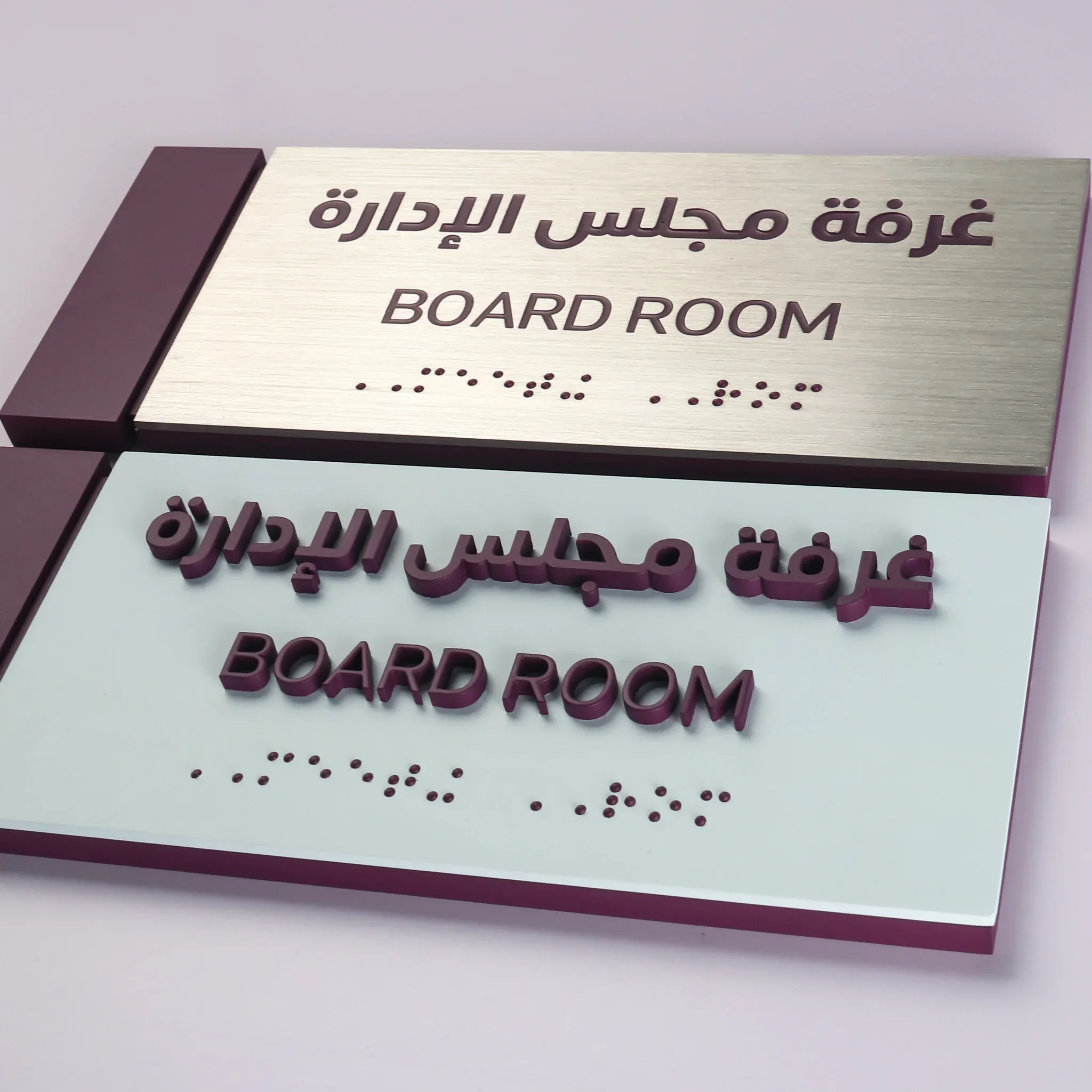
Braille signs include small raised dots that represent letters, numbers, or words. These dots are read by touch.
Braille is often added below raised text on accessible signs. For example, a room sign may show “ROOM 205” in raised characters, with Braille below it.
However, a Braille sign is not always a complete tactile sign by itself. If a project requires both raised text and Braille, the sign must include both parts in the right layout.
For B2B buyers, this point matters. Ordering only Braille dots without raised characters may not meet the needs of the project. In the same way, ordering only raised text may be incomplete if Braille is also required.
Tactile Signs vs Braille Signs: The Main Difference
The main difference is the reading method.
Tactile signs use raised characters, raised symbols, or raised pictograms. These elements help users feel the shape of letters or icons.
Braille signs use raised dot patterns. These are made for users who read Braille.
In many real projects, the two are combined into one sign. This is common for ADA signs used in permanent rooms and building areas.
So, when comparing tactile signs vs Braille signs, it is better to think of them as two related features, not two fully separate product types. A complete accessible sign may need raised characters, Braille, strong contrast, a proper finish, and correct mounting.
Where Are ADA SignsCommonly Used?
ADA signs are often used in public and commercial spaces in the United States. They are common in offices, hotels, schools, hospitals, restaurants, airports, apartments, retail stores, and public buildings.
Typical locations include restrooms, exits, stairwells, elevators, room doors, floor levels, meeting rooms, and permanent service areas.
Some signs are used for wayfinding. Others identify a fixed room or space. This difference can affect the sign design. For example, a wall sign for a permanent room may need tactile text and Braille, while a directional sign may have different requirements.
Because rules can vary by country, state, city, and project type, buyers should always confirm requirements with the project architect, contractor, code consultant, or local authority.
Why Raised Characters Matter
Raised characters help people read signs by touch. They are especially useful in permanent room signs and key building signs.
For good usability, raised characters should be clear, smooth, and easy to feel. The edges should not be sharp or rough. Also, the letter style should be simple. Highly decorative fonts may look nice, but they can be hard to read by touch.
In many accessible signage projects, raised characters are uppercase and made with a clean sans serif style. Spacing also matters because letters that sit too close together can be hard to identify.
For buyers, this means brand style may need small adjustments. The sign should still look professional, but function must come first in accessible areas.
Why Contrast and Finish Matter
Accessible signage is not only about touch. Many users read signs by sight, so contrast is also important.
A sign should have clear contrast between the text and the background. For example, dark text on a light background or light text on a dark background can help users read faster.
The finish also matters. A high-gloss surface may reflect light and make the text harder to see. Therefore, matte or low-glare finishes are often used for ADA signs and other accessible signage.
For premium projects, materials can still look refined. Brushed metal, painted acrylic, satin stainless steel, and layered panels can all be designed with both style and function in mind.
Common Materials for Accessible Signage
Accessible signs can be made from many materials. The right choice depends on the site, design, budget, and expected wear.
Acrylic is common because it is clean, cost-effective, and easy to customize. It works well for offices, schools, clinics, and hotels.
Aluminum is light, durable, and suitable for many commercial uses. It can be painted, printed, or finished in different ways.
Stainless steel gives a more premium look. It is often used in high-end hotels, corporate offices, and luxury interiors. River Stone also manufactures stainless steel letters and custom metal signs for commercial projects.
For non-illuminated signs, materials and finishes can be matched to the full building signage package. This helps keep room signs, wall signs, plaques, and brand signs consistent.
What Buyers Should Prepare Before Ordering
Before placing an order, buyers should prepare a clear sign schedule. This schedule should list each sign type, room name, room number, size, quantity, material, color, finish, and mounting method.
Next, confirm which signs need raised characters and Braille. Do not assume every sign has the same rule. Some signs identify rooms, while others guide traffic or share general information.
Then, provide artwork files in a clean format. Vector files are best for sign production because they keep shapes and text clear. If a brand font is used, the text should be converted to outlines to avoid font changes.
Also, confirm wall type and mounting height with the project team. Correct placement is a key part of accessible signage.
How Custom Manufacturing Helps
Custom manufacturing helps buyers match accessibility needs with project design.
For example, a hotel may need room number signs, restroom signs, stair signs, elevator signs, and lobby brand signs. Each sign may have a different size or finish, but the full package should still feel consistent.
River Stone can support custom non-illuminated signs, metal letters, plaques, and stainless steel signage for business projects. This includes products such as custom freestanding stainless steel letters for reception desks, display counters, showrooms, and brand spaces.
By working from project drawings, artwork files, material notes, and finish samples, the sign package can be planned with better control.
Common Mistakes to Avoid
One common mistake is treating Braille as the only accessible feature. In many projects, raised characters are also needed.
Another mistake is using a decorative font for tactile text. It may match the brand, but it may not be easy to read by touch.
Some buyers also forget contrast. If the text and background are too similar, the sign may be hard to read.
In addition, poor placement can cause problems. Even a well-made sign may fail its purpose if it is installed in the wrong location or at the wrong height.
Finally, buyers should avoid ordering signs before the room names and numbers are final. Late changes can increase cost and delay delivery.
FAQ
Are tactile signs and Braille signs the same?
No. Tactile signs include raised characters or raised symbols that can be read by touch. Braille signs include raised Braille dots. Many ADA signs include both features.
Do all accessible signs need Braille?
Not always. Requirements depend on the sign type, location, and local rules. Permanent room identification signs often need raised characters and Braille, while some directional or informational signs may follow different rules.
What are raised characters?
Raised characters are letters or numbers that stand above the sign surface. They allow users to feel the text by hand. They are a key part of many tactile signs.
Can accessible signage still look premium?
Yes. Accessible signage can use quality materials, clean layouts, and refined finishes. The key is to balance design with readability, touch function, contrast, and correct placement.
What should buyers confirm before production?
Buyers should confirm sign text, room numbers, materials, colors, finish, size, mounting method, raised characters, Braille needs, and installation location before production starts.
Final Thoughts
Tactile signs and Braille signs are closely linked, but they are not the same. Tactile signs use raised characters or symbols. Braille signs use raised dot patterns. In many commercial projects, both are used together as part of ADA signs and accessible signage.
For project buyers, the best approach is to plan early. Confirm the rules, prepare a clear sign schedule, use readable layouts, and choose materials that fit the building. With the right planning, accessible signs can be clear, durable, and well matched to the full project design.
Share to:


